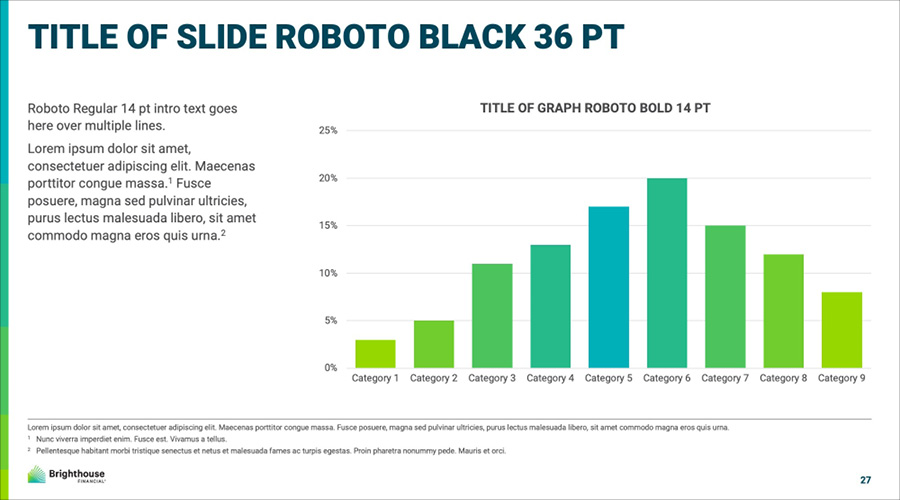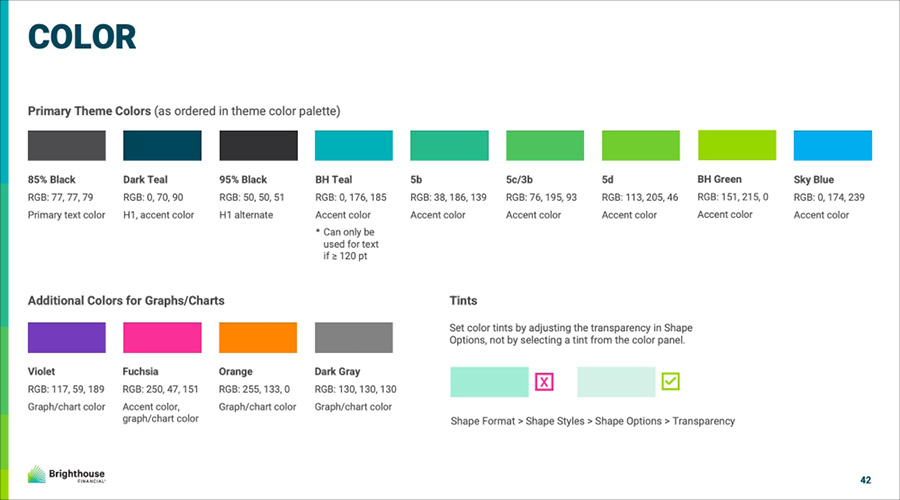
The needs of the company had grown since the original template was created in 2018. There were two existing size formats and separate visual systems for Consumer and Advisor-facing materials. The existing visual system that used the brand colors of bright teal and green to differentiate information and highlight key details didn't meet accessibility standards and resulted in continuous visual reworking of presentations depending on requirements from different financial firms.
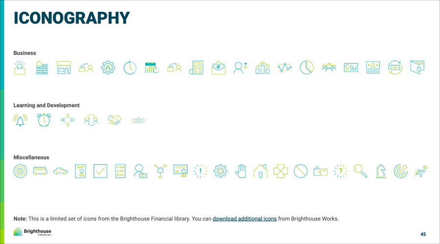
I performed an internal audit of existng presentations to determine repeat needs and to assess areas where we could improve formatting for increased impact and ease of use. I created a survey and met with internal stakeholders across Product, Learning & Development, Sales, Marketing, and IT to address pain points with current templates, find common requests across departments, and to test working versions of the updated templates. For the next phase, I worked with my art director, Malcolm Montgomery, to create a new design system for a combined consumer and advisor template that would work across audiences with minimal edits. The new system relied on hierarchy and a grid system broken into thirds to clearly present information while meeting ADA standards for readability. We also tripled the number of master slides in the template to increase standardization across the company and give users the flexibility to create more dynamic presentations.